
Branding has changed
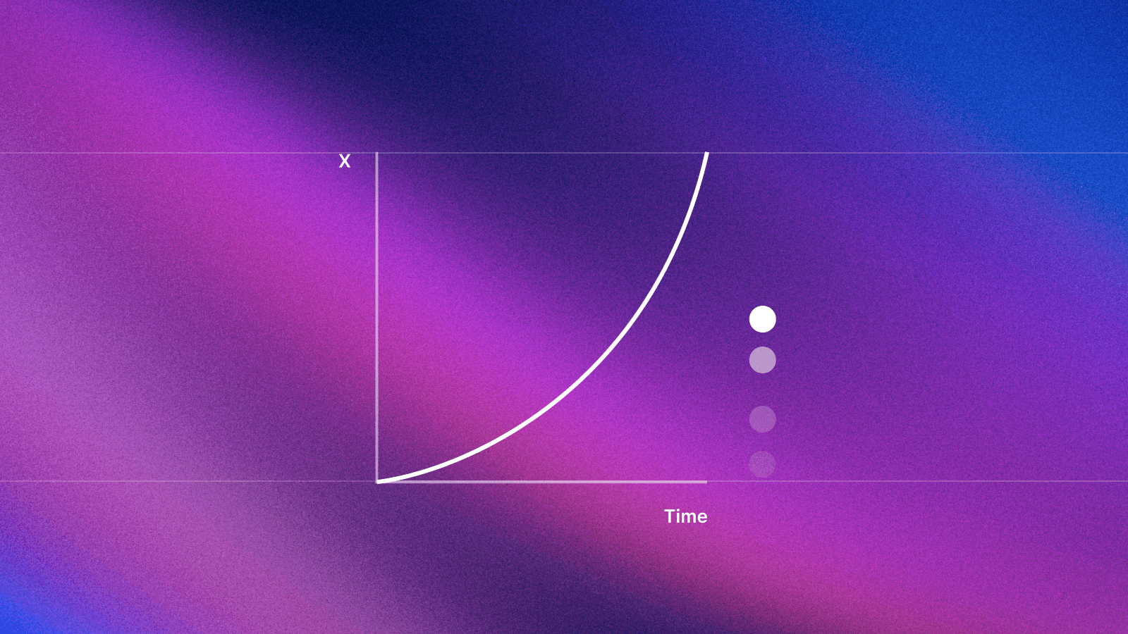
Logos, colors, and typography are still essential, but in a digital-first world, motion is what makes brands feel alive. It enhances engagement, improves usability, and makes interactions feel fluid, responsive, and unforgettable.
Yet, many brands still treat motion as an afterthought—leading to inconsistency, awkward animations, or branding that feels stuck in the past.
Let’s fix that. Here’s how to integrate motion into your brand guidelines—clearly, consistently, and intentionally.
Define the role of motion in your brand

Before adding motion, take a step back. Ask yourself:
What should motion express—playful, bold, or refined?
How should motion enhance interactions—guide users, reinforce hierarchy, or add personality?
Where will motion appear—logos, UI, social media, video, or advertising?
Real-world examples:
Dropbox uses motion for seamless, intuitive interactions that enhance usability.
Cash App employs bold, kinetic animations to reflect its high-energy, digital-first brand identity.
Motion isn’t decoration. It’s a strategic asset.
Set motion principles for consistency
Just like typography and color, motion needs rules to feel intentional and unified across all platforms.
What to define:
Speed & timing – Should animations feel quick and energetic or smooth and deliberate?
Easing & flow – Should elements ease in and out naturally or snap into place?
Hierarchy & priority – How should motion guide attention without overwhelming users?
Consistency – How should motion feel across UI, marketing, and digital experiences?
Airbnb’s motion system
Airbnb’s animations feel natural and effortless, whether you’re booking a home, scrolling through listings, or navigating the app. Their easing curves and duration guidelines ensure a cohesive experience across all touchpoints.
A clear motion system means every animation reinforces the brand—instead of feeling like a random effect.
Apply motion to key brand elements
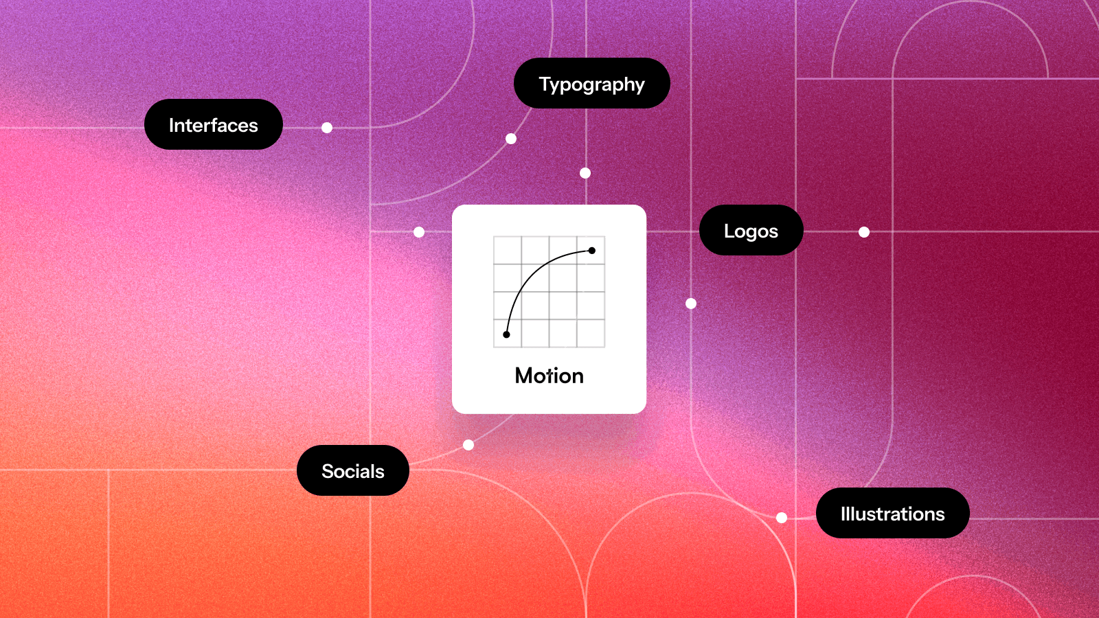
Motion isn’t just for flashy effects. It should be baked into every touchpoint to create a unified experience.
Where motion matters most:
Logos and brand marks
Design an animated version of your logo for digital platforms.
Make sure motion reflects your brand personality—Netflix’s sleek “N” animation feels cinematic, while Duolingo’s owl blinks and wobbles to feel friendly and playful.
UI and digital interactions
Micro-interactions—button presses, hovers, and transitions—should enhance usability, not distract.
Motion should help users navigate and understand interactions—not feel like a gimmick.
Social media and video
Define consistent transitions, typography motion, and branded animations for digital marketing.
Motion should feel on-brand across all platforms—not random or trendy.
Spotify’s motion system
Spotify uses pulsing animations and smooth transitions that feel dynamic, rhythmic, and unmistakably Spotify.
When done right, motion makes a brand feel consistent, recognizable, and alive.
Build a motion asset library
Gojek Motion Library — Lottiefiles
To scale motion consistently, brands need a library of reusable assets that teams can pull from.
What to include:
Pre-set animations for logos, buttons, and UI interactions
Templates for social media motion graphics
Guidelines for motion pacing, rhythm, and hierarchy
Airbnb’s Lottie animations
Airbnb developed Lottie, a tool that allows designers to export motion assets as lightweight, high-fidelity animations that work seamlessly across apps and websites.
With a well-documented motion library, every animation feels on-brand and high-quality—no guesswork needed.
Document motion in your brand guidelines

Motion should be a core part of your brand guidelines—not an afterthought.
Your motion guide should include:
Motion philosophy – Why motion matters for your brand
Motion principles – Speed, easing, hierarchy, and consistency rules
Application examples – Motion in logos, UI, video, and marketing
Dos and don’ts – Common mistakes and best practices
Without documentation, motion is left open to interpretation—and inconsistency follows.
Motion in Branding: Best Practices & Why It’s the Future

Motion isn’t just a design trend—it’s how modern brands stay relevant, interactive, and engaging. In an increasingly digital world, brands that embrace motion effectively stand out, enhance user experience, and create a seamless, recognizable identity. Yet, most brand guidelines aren’t built for motion.
To use motion effectively, keep these best practices in mind:
Give motion a purpose – Use it to guide users, reinforce hierarchy, and bring personality to your brand.
Keep it subtle and user-friendly – Animations should enhance, not overwhelm.
Stay consistent – Define motion rules to ensure cohesiveness across platforms.
Match motion to brand personality – A luxury brand might use slow, elegant fades, while a playful brand leans into snappy, bouncy animations.
Learn from the best – Google’s Material Design, Apple’s Human Interface Guidelines, and Airbnb’s motion framework are great references.
As brands continue to evolve, integrating motion into brand guidelines is no longer optional—it’s essential.
Future-proof your brand guidelines
Sameness is redefining how brands manage and scale motion guidelines—making them interactive, dynamic, and built for the future.
Be part of the next generation of brand guidelines. Join the Sameness waitlist and be the first to experience motion-ready brand guidelines.
This article is written to be easily scannable, allowing you to grasp key insights quickly. We know you’re busy, so we’ve kept it structured and easy on the eyes.
Get Early Access
Join our waitlist now to be one of the first to try it out and get exclusive early access before we launch.